Zara Redesign
Clothing Website Redesign
UX Research
UI Design
HTML/CSS/Java
Web Design
Zara is a Spanish fast-fashion shop noted for its fashionable yet reasonably priced apparel and accessories. There are numerous pain points, such as trouble reading the texts and navigating the items, and the poor usability of Zara's website causes a great deal of aggravation among its customers. After deciding on Zara as the "Website Redesign" project, our first order of business was to conduct customer interviews to gain a more granular understanding of all the difficulties that needed redesigning.
Many issues were raised throughout the interviews, including difficulty navigating the website, difficulties with size selection or utilizing the filters, and some even expressing confusion about how to locate the products. These were our pain points, which we sought to address while rebuilding the website, among other things.
The majority of interviewees preferred to buy online through mobile apps and websites rather than in-store. When making purchases, the preferred payment methods were Apple Pay, Google Pay, or credit card.
The results also showed that most interviewees preferred to purchase official and casual clothing. Most of them were between the ages of 20 and 28, and were either students or professionals. While most interviewees had a positive experience buying online, one common negative experience was receiving the wrong size of clothing. However, all were able to return the clothing to get new ones that fit.
In summary, the interviews revealed several key findings about the buying behavior and preferences of the interviewees, including preferred buying platform, payment options, considerations for purchase, preferred clothing style, updates anticipated, age range, common categories, after-purchase experience, and user interface experience
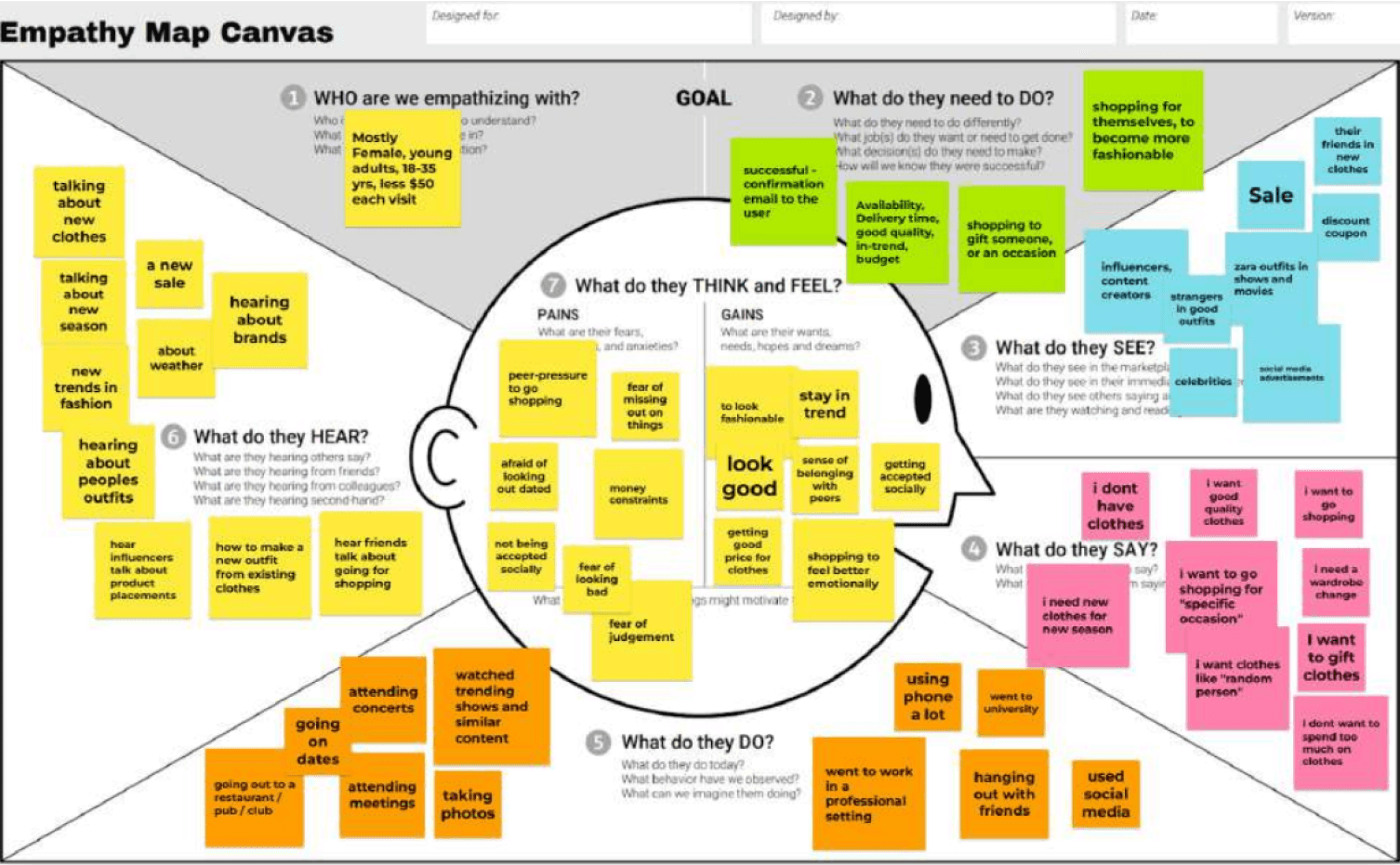
According to the website traffic analysis from Similar Web, women accounted for 66.95% of Zara's online store customers, while men accounted for only 33.05%. In terms of age distribution, the audience aged 25-34 is the largest, accounting for 33.73%. The second largest age group is 18-24-year-olds, there is 26.78%. With the above information, the first target audience of Zara is mainly adult females 25-34 years old, the second target audience is youngsters 18-24 years old.
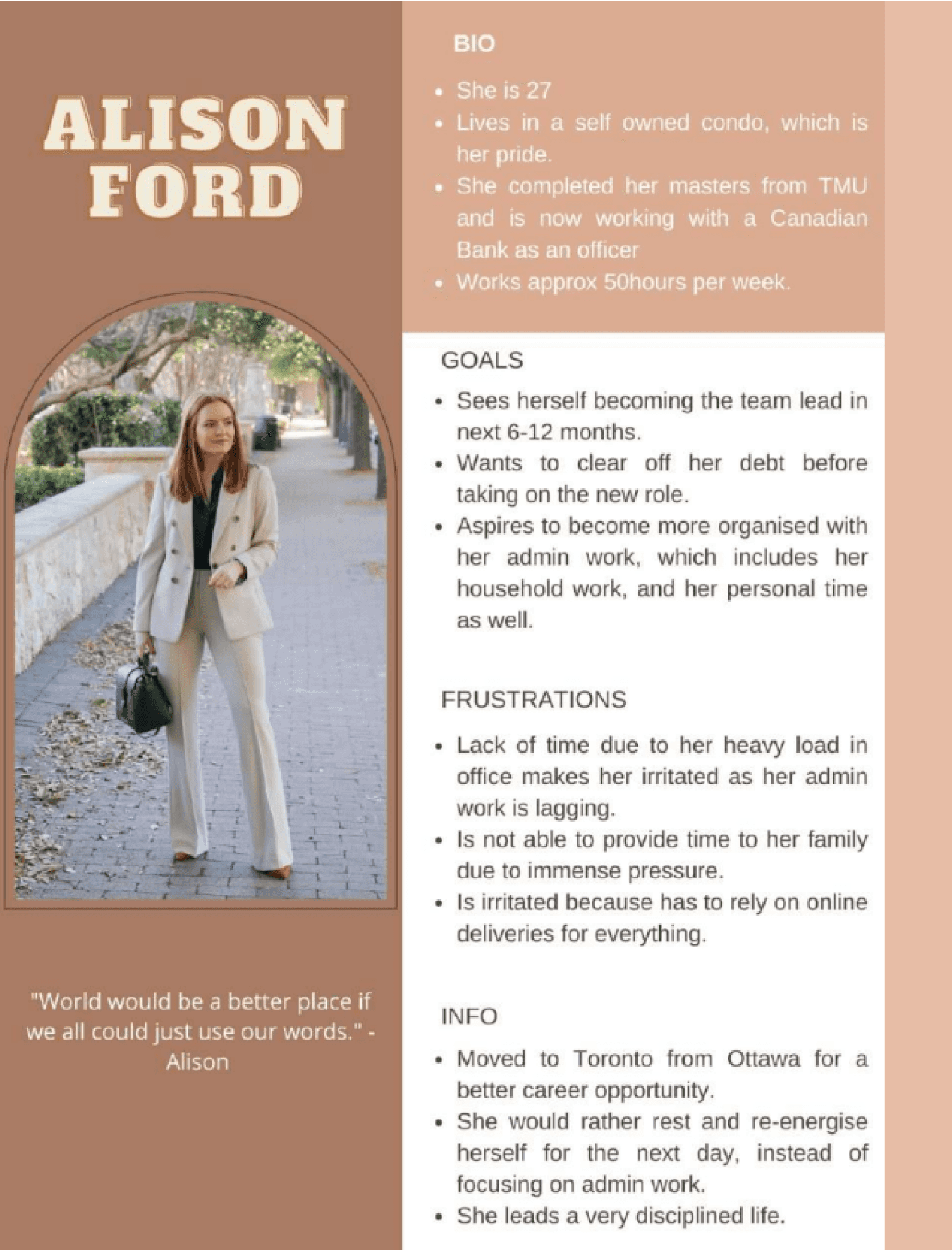
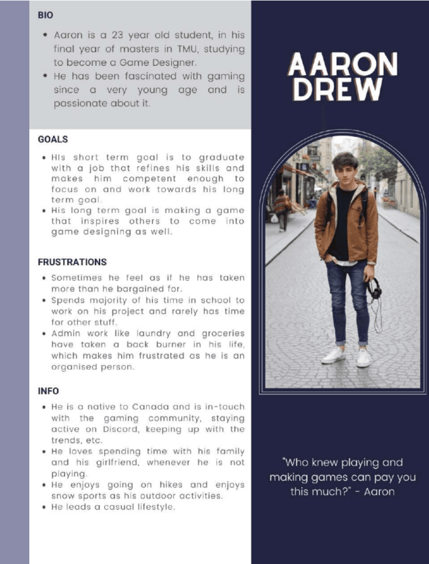
By understanding these additional details about our persona we can create more targeted questions for user interviews and gain a deeper understanding of what our users actually want when they shop for clothes at Zara. This will help us tailor our website and marketing strategies to better meet their needs and preferences.
We noticed the need to shift the emphasis away from editorial material and towards products as part of our efforts to improve the website. This update was implemented in response to user feedback indicating that the significant emphasis on editorial material made it difficult for consumers to identify and purchase products. We implemented a number of design improvements to facilitate this transformation, focusing on product visibility and accessibility. For example, in Figma, we established a 4pt spacing scheme, which maintains uniform spacing throughout the website and makes it easier for customers to explore and find the products they want.
We changed the typeface in addition to the spacing scheme. We choose “Playfair Display” and “Inter” as our primary fonts because they are both extremely readable, which is vital for persons with visual impairments. We also chose a color palette that is consistent with ZARA's brand image while yet being accessible. This signifies that the website's colors comply with the WCAG AAA grade accessibility requirements, ensuring that the website is accessible to users with a wide range of visual impairments. Before, the text was hard to read on top of images.
Overall, these adjustments represent our dedication to developing a website that is both visually appealing and extremely functional. We intend to provide a more user-friendly experience by prioritizing product visibility and accessibility, making it easier for consumers to find and purchase the products they seek. Furthermore, by keeping the ZARA brand image, we hope to develop a website that is both engaging and familiar to visitors, thereby fostering loyalty and trust in the company.
Published Website: https://zara-dg8002.netlify.app/
